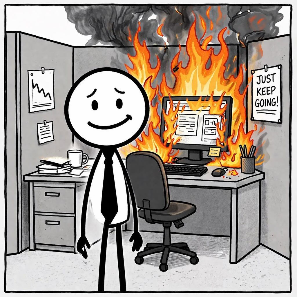
Published cartoon ·
The Absence of Evidence Dashboard
The bad things never happened. Fortunately, the reporting can still look good.
Download the seven reel-friendly panels (ZIP) ↓
Why this one bites
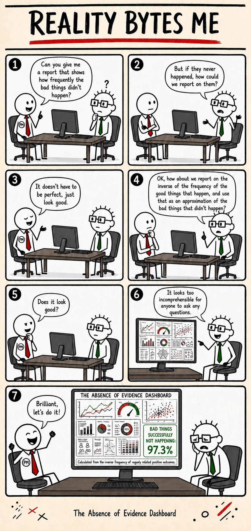
A PM asks an engineer to measure the frequency of disasters that did not occur. The engineer proposes an increasingly incomprehensible approximation, and the dashboard earns approval precisely because nobody will understand it well enough to ask questions.
This fictional workplace cartoon satirises reporting that values appearance over meaning. Its 97.3% success figure is part of the joke, not a measured result.
Transcript
- Panel 1 — PM: Can you give me a report that shows how frequently the bad things didn't happen?
- Panel 2 — Engineer: But if they never happened, how could we report on them?
- Panel 3 — PM: It doesn't have to be perfect, just look good.
- Panel 4 — Engineer: OK, how about we report on the inverse of the frequency of the good things that happen, and use that as an approximation of the bad things that didn't happen?
- Panel 5 — PM: Does it look good?
- Panel 6 — Engineer: It looks too incomprehensible for anyone to ask any questions.
- Panel 7 — PM: Brilliant, let's do it!
- Dashboard: BAD THINGS SUCCESSFULLY NOT HAPPENING: 97.3%
- Footnote: Calculated from the inverse frequency of vaguely related positive outcomes.
Reading notes
Counting an event requires a definition of the event and a way to observe it. Counting something that did not happen also requires a meaningful population of opportunities in which it could have happened. Otherwise almost any percentage can be manufactured by choosing a convenient denominator. The cartoon's inverse-frequency formula deliberately avoids that work while borrowing the appearance of mathematical sophistication.
The engineer's proposed number is accepted for a social reason: it discourages questions. That is the reversal at the center of the joke. A dashboard should make important conditions easier to inspect. This one is successful because its audience cannot confidently interrogate it. The decimal point supplies precision without supplying meaning, and the green presentation turns that precision into reassurance. The missing review is not whether the chart looks professional, but what observation would cause the reported success figure to change and what decision anyone could responsibly make from it.